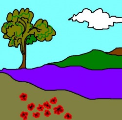
 Today I was supposed to be playing tennis but happily it was raining because I wanted to keep painting. I decided to set the goal of completing a painting by the end of the day. Given that I was going to use a large square stretcher of 100cm x 100cm I chose to do a painting of a sqaure, imagined landscape (seen at left) made on the computer earlier this year. I brought the pic up on my laptop and drew it onto the canvas with a permanent black marker. I thought it would be a good project to photograph from start to finish, but stupidly forgot about the photos once I started painting. So I have no photo of the line drawing, however the close up in photo 1 below shows the tree trunk in black marker. Initially, I made up some colours similar to those in the original image and blocked in the relevant areas on the canvas as a starting point. Photo 1. Shows black marker line drawing of tree trunk on primed linen. Photo 2. Areas of colour filled in are loosley based on the colours in the digital reference image. Photo 3. Tree and distant mountain painted in raw umber. Blue area over painted in transparent white to reduce intensity. Photo 4. Sky filled with a blend of aquamarine and white. Photo 5. Shows sky during repainting with a lighter blue as the original sky was too intense. Photo 6. Sky colour now finished and lower part of blue area lightly over painted with violet/white blend. Photo 7. Tree altered with dark green sections. Phal0 green painted over landscape at right. This was subsequently altered again with a lighter tone. Photo 8. (Kept forgetting to take photos) Black outlines around tree, cloud and the landscape elements. Added small chrome yellow highlights to the tree to bring it forward. Painted over the foreground with a transparent olive wash. Among other things, this addition served to bring the red flowers in the foreground out of the picture space and also assisted in balancing the composition with the green tree foilage in the upper left and the green section at mid right. I also scumbled some raw sienna over the umber mountain that is cut off by the right edge of the stretcher. I also finished the red flowers in the foreground with the addition of orange and magenta followed by black centres. Then painted over them with gloss varnish to bring out the olours. 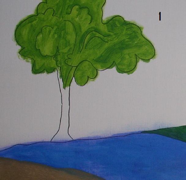 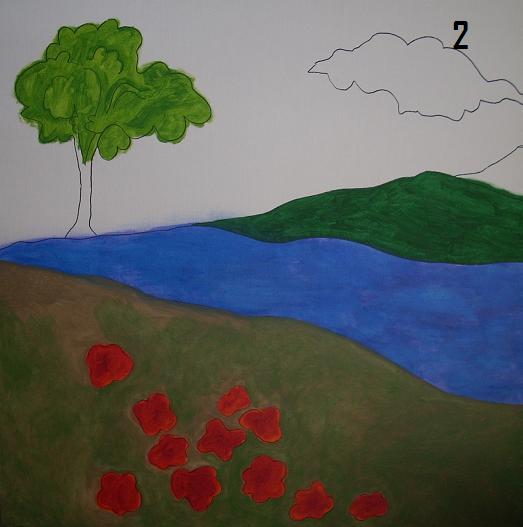 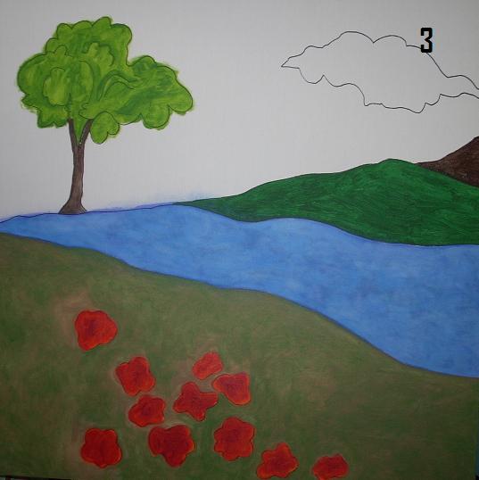   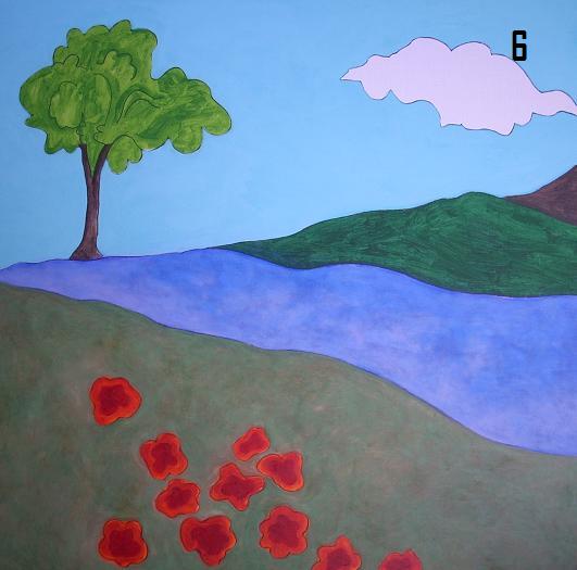  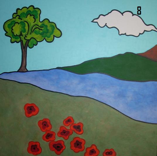  The ninth and final photo shows the completed painting taken with a flash because night had fallen. I started the painting at about 1:30 pm and painted continuously until about 8pm. Around 20 minutes later I returned and finished the painting with a blue wash in the lower sky at the horizon line and a gloss varnish over the tree and the green area at the right (hence the glare of the flash as seen in the photo).
Shortly before 9 pm the painting was finished and all up it took about 6.5 hours from start to finish. I like the Patrick Caulfield look of the original digital image, however I was determined that the painting would be something else. You'll have to take my word for it (until I take a better photo), but it looks better than the flash photo indicates. It is a pretty picture that is quite different from anything else I have painted. I have done quite a few flower pictures on the computer and may make paintings of some of them in the future. Then again, this might be a one off.
0 Comments
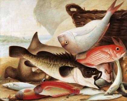 Fish Catch at Dawes Point, Sydney Harbour c1813 Fish catch at Dawses point is one of those paintings that just stays in your head. I have only seen it in the flesh once when on display at the Art Gallery of South Australia many years ago. What is it about some paintings that leave such a lasting impression? It must be the sum of all it's parts combined with the history the viewer bringswith them when they stand before the painting. The only thing I know bout John Lewin apart from the paintings I have seen (mostly reproductions) is that he is apparently Australia's first professional painter. This painting reveals the beauty of oil paint, it's rich, vivid, glistening colour still looks fresh and alive. The image is slightly surreal with the detailed realism of the individual fish contrasted with the unreal way some of them float in the picture space. Freshly caught fish cannot physically rest upon each other the way these fish in Lewins painting do. But they make it so much more engaging. Some paintings have to be revisited. For me these include Magrittes In Praise of Dialectics and Peter Powditch's The Big Towel, both in the NGV. Sadly I cannot find a reproduction of the Powditch painting. It is a closely cropped female torso wrapped in a green towel and painted in a pop/Leger kind of way. Another one is John Brack's Barber Shop (below left). I am not sure why I like it so much but the two men staring out are compelling . However, the one element that makes the painting something other than ordinary is that yellow lamp shade reflected in the mirror above the seated man. To show what I mean I removed it from the image on the right below. The painting loses much more than a little yellow lampshade, don't you think? 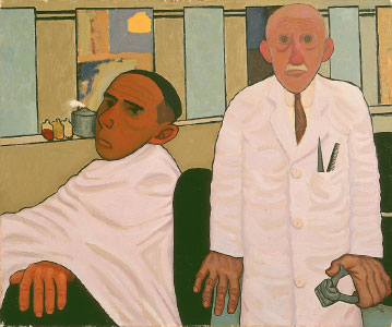 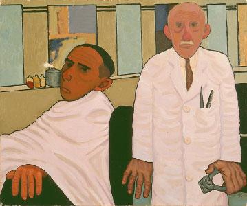 I love painting and looking at paintings.
 < Shadow Factories. Howard Arkley.
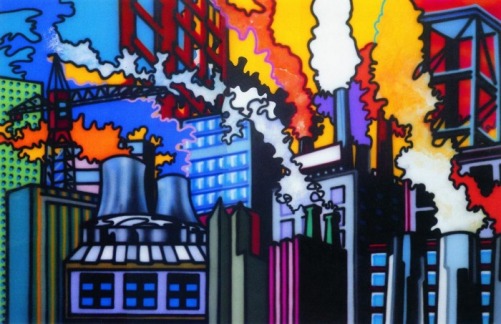
It's a name that is now full of misconception and myth. The name fills me only with feelings of respect and love. I was most fortunate to get to know Howard and be asked by him to work as a studio assistant from about 1989 to 91. It was fun and stressful and invaluable to me. Howard was open and sensitive and incredibly intelligent and could converse on and give opinion on any subject raised. I remember when he would talk of his friends Juan Davila, John Nixon, Tony Clarke, PeterCorrigan, Elizabeth Gower and many more, his love for them was obvious. I met some of those friends mentioned but didn't know any of them. Apart from Juan Davila (who I had a few drinks with one afternoon at the Duke after Howard introduced us), I knew of them only via Howard's experience. He always spoke of his friends with affection underlying his words. Howard was a very sensitive soul and was a loyal friend to the people he trusted. He was generous and felt compassion for his fellow human beings. I will never forget the day we had worked a hard day in the studio on a house show. We were hot and tired and Howard asked me how long it had been since I had eaten a steak. Being a destitute art student, I couldn't remember. Howard said thatwe both needed some nourishment and soon we were carrying his precious (and heavy) air compressor down the stairs from his Windsor studio and we wheeled it to the local pawnshop and he pawned it for cash. He paid me for whatever hours we had done and threw in another $20. He then took me to the pub and bought us a big steak each and we washed them down with several beers. We ended up at the Esplanade hotel were he told me he loved Alison Burton and worked up the courage to phone her. It was so bittersweet that Alison and Howard would marry years later only days before Howard left this world we live in. Howard is in my thoughts every time I walk into an art gallery or step into my studio, or pick up an art book. He was a friend, a confidant and will always remain an inspiration. Howard is a person who touched and effected many lives and instilled a love of art and painting in many Melbourne students and artists. His influence will be felt for years to come. 'Shadow Factories' 1991(?) seen above was a major undertaking for Howard and I was fortunate enough to assist in it's making. I will never forget the time Howard was painting the orange smoke coming from the chimney in the right of the painting. He was vigorously blending orange and white Matisse acrylic together, his paintbrush flicking back and forth across the canvas. Howard suddenly said in his loud nasal tones ,words to the effect of "Stop the press, stop the press, Arkley shocks the art world and goes all Abstract Expressionist, imagine that" I remember Howard saying his paintings look the way the do because they will be hanging in lounge rooms and will have to compete with the television to be noticed. 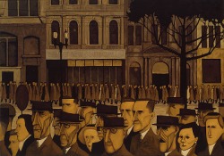 < Collins Street 5pm John Brack 1955 I love this painting. The stiff, regimented individuals who make up the crowd heading home are all tight and controlled and seemingly self conscious. Heading home from the structure of their work. All dressed in the attire their work and society expects of them. All filing out of the city to go to their homes. All physically doing the same thing, walking to catch a tram or train maybe, rigid and controlled. But what is going on in their heads? The woman second from the right, is she thinking about what to make for her family for dinner? Or is she trying to tolerate her overly tight new undies that are cutting into her hips? That man in the centre with the hat, could he be trying to remember where he left his wallet at lunch time? Or might he be trying to decide which brothel to go to later in the night? And the lady to his right, she might be trying to work up the courage to quit her job in the morning. Who knows what they are thinking?. I bet we might be shocked if we actually knew.  Africa Rosalie Gasciogne 1995 > A wonderful example of the ability of an artist to arrange mere 'stuff' in such a way as to create beauty. 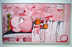 < Painter in Bed Phillip Guston 1973 If you described this to someone, "it's mostly red, pink and white with some bright orange and lime green and black", i am sure they could not imagine such a combination of colours would result in such a harmonious image. Guston's paintings are meant to be seen in the flesh. A painter if ever there was one . 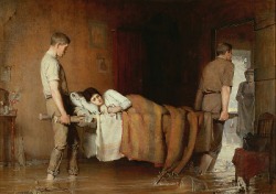 Flood Sufferings Aby Altson 1890 > This large painting hangs in the NGV and whenever I see it I cannot stop looking at that woman in the doorway. Why does she look like she was collaged into the picture? Was she a last minute addition? Is she a ghost? Maybe Altson painted her in those greyed tones in an attempt to keep her from taking our eyes off the two heroes rescuing the young woman who is ill, pregnant, or precious or whatever. But that jarring edge, where the concerned looking woman's figure meets the door frame, just jumps out at me. It is just wonderful. Pictorially, she is obviously in the background out in the light of the sky yet she is on top of the picture plane. For years I have deliberately avoided finding out more about this painting. I don't want to know that she was the last thing painted, but I suspect she was. I like holding on to the doubt and the mystery. 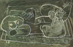 < Baby Ian Fairweather 1955 A drawing done with paint. This has the raw, primal, yet beautiful feel of the wonderous paintings of Bison in the caves of Lascaux in France. Fairweather was in touch with something eternal. 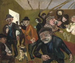 The Rosstown Pub John Perceval 1944 > A great picture that conveys the rushed swirly giddiness of intoxication as the 6pm closing time draws closer. The puke green only adds the the effect. I used to live near the Rosstown pub in Caulfield in the 8o's. 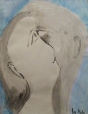 < Heart in Blue Joy Hester An elusive moment when two feel they have become one. Joy Hester is one of Australia's greatest artist's and her creativity found a way to express itself in the most difficult circumstances. Australian's including Clarice Beckett, Margaret Preston, Dorritt Black and Joy Hester made great art despite being women in a sexist society. 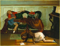 In the Living Room Balthus 1941-43 > There is something wrong with this image (and most of Balthus' images) It makes me uneasy, sleazy and sneezy. The tablecloth is old and dirty looking. There is something grimey in the atmosphere, I can feel it in my nostrils and my nostrils want to purge myself of the tainted air. This is proof that an image can evoke unspecified emotions. I am reminded of Hitler's maniacal evil brilliance. I like this painting but to like it, I also have to hate something about myself. So magnetically creepy.   Art books. Where would we be without them. At the risk of seeming non committed or lazy, fact is i am a home body and the idea of travelling around the globe looking at art is unappealing. Don't get me wrong, there are paintings I would love to stand before, but the travel and the tourists and the security and all the rest of it, I can do without.
Having said that I know that nothing can compare to standing in front of a work of art. For example, until I stood in front of Jackson Pollock's Blue Poles as it filled my field of vision, exposing a hand print and cigarette butts and broken glass as remnants of the physical act of creating it, I had no concept of it's physical presence. These signifiers of the work's making, drawing me into it's vast layered pictorial space. This was not an experience that could be conveyed by the limited scale and flat surface of a printed image. Despite the obvious limitations as described above, when appreciated on their own terms, art books feed and nourish a hungry curiosity for great works of art. My thick monographs on the likes of Ernst, Picasso, Magritte and Gauguin along with beautifully photographed books of Egyptian Murals are among my most treasued possessions. Many of those murals are out of bounds to visitors and the books are the only means by which one can witness the magnificent imagery painted thousands of years ago. Each artist's or movement's story leads to other artists and to roads that lead to even more previously unheard of names. It was while reading about Nolan and the Angry Penguins in 1987 that the name Joy Hester first came to my attention. Since then, I am aware that a new book will lead to new names and paintings that will make me have to reassess the things I thought I knew. That is such an excitingly endless process to embrace. Some books are not taken of the shelf for years until one day something draws one back to them again. It is then that long forgotten words and images are seen in a new light with a fresh perception, a perception influenced by all the things you now know ( or think you know) since you last turned the pages. 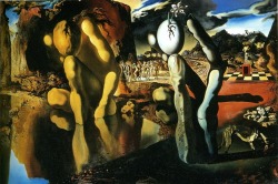 The Metamorphosis of Narssicus Salvador Dali > One day when i was at high school, i was walking home with a girl named Trudy. For some reason she mentioned Salvador Dali and i had no idea who she was talking about. She stopped and opened her school bag and pulled out two postcards of Dali paintings. One was The Persistence of Memory and the other was The Metamorhosis of Narcissus seen at right. As soon as i saw the images, i realised I had seen them before. That dream like realism with the long shadows and morphed limbs were unforgettable. The name Salvador Dali sounded like a perfect match for scenes he had created. 'Saal vadoor dah leee' - the way it rolls off the tongue is like a verbal version of the droopy exotic forms in the paintings. I had a not insignificant crush on Trudy at the time, and the Dali images and their dip into the subconcious and eroticism seemed to compliment my lustful teenage imaginings. It is for this reason that I think nearly all teenaged kids like Dali's paintings. Dreams, sex, the unconscious, all very interesting to human beings developing their sense of self. Full rounded fleshy forms in a dream like space. It's the visual expression of the mental images inside every 15 year old boy's head, and I suspect in most girl's heads also. To my naive young mind, Dali was an incredible genious. Now, i think of him as a loopy paranoid obsessive with a marvellous ability to draw and paint and who was exploited obscenely at the end of his life. I suspect the truth rests somewhere in between those two extremes. Earler this yearI went to the Dali exhibition at the NGV and found it much less interesting than the simultaneous John Brack Retrospective. 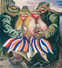 < Victory Girls 1943 Albert Tucker. In 1987 i discovered the Angry Penguins while learning about Nolan. Paintings by Arthur Boyd, John Percival, Albert Tucker and the great Joy Hester instantly appealed to me. The impact of Surrealism had obviously been absorbed by these artists but it's evidence was subtle when compared to Dali. The Images of Modern Evil series by Tucker that includes Victory Girls was dark and brooding. With their grotesque faces and bare breasts in your face, the Victory Girls and their grabby pig faced suitors were ugly and unforgettable. A Tucker painting called Psycho with it's ugly contorted subject trapped in a confined room, was an image that had burned itself into my impressionable 24 year old head. The red green colour combination left a grating vibration on the senses and i was forced to consider the emotional impact of colours and their combinations. 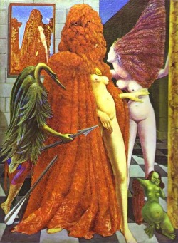 Max Ernst > In 1988 i quit my job as a colour matcher at Dulux Australia and enrolled at Moorabbin Tafe in order to get a folio together to get me into Art school. It was here that I first met Howard Arkley. One of the first painters he put me onto was Max Ernst. Ernst's use of frottage and dripping paint to create his surreal landscapes and bird like female forms was really eye opening to me. Ernst made me consider the tactile aspects of painting and technique. Up until then, it was all about the image to me. Howard was a very astute mentor to his students and his advice and suggestions were very considered and usually just what was needed to expand one's outlook and development. Ernst's art is very earthy and real to my eyes. The tactility of paint and it's possibilities are always apparent. The NGV has two small imaginary landscapes by Ernst and to me they just want to be touched. One of my favourite artists who's work I have not seen enough of.  < Paul Delveaux Dreams full of tits and bums, ahhh good old Surrealism The thing about Surrealism that I really like is that it emphasised the abilty to make the unvisible visible.
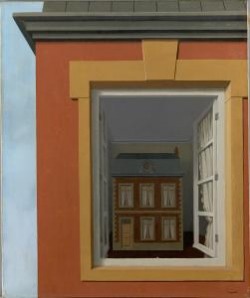 Rene Magritte -In praise of Dialectics 1937 The Magritte painting appealed to me in a formal sense. I liked the way it was cropped and it's neat, tight arsed painting style looked pretty good to me at the time. It's austere, controlled air was cool and otherly. Having said that, i suspected that it conveyed something of the personality of the artist. I don't much like thick drippy expressionist paintings and liked them even less in 1987. At that timethe painting was displayed in a crappy little gallery in the European art section of the NGV right next to an entrance to another gallery. It was far from the best location for any painting but this painting still stayed with me regardless. On the way out I went to the NGV book shop to purchase a post card of the Magritte but there wasn't one available. At some stage in the following days I painted my open door pic. I remember it was a hot warm day and I was impressed at how fast the acrylic paint dried. Looking at it now it is so very flat and lifeless. The Magritte, in comparison, has the illusion of depth and space that pulls one's eyes into the picture. That illusionistic spacial depth coupled with the pull of the doorway of the small building inside the window, holds my gaze every time I check out that painting when I go to the NGV. On more than one visit I have been compelled to return to that painting for one more look before I leave. I subsequently made a point of learning more about Magritte and also Surrealism. And, of course Dali 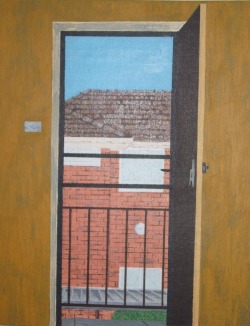 Open Doorway 1987 On the way home from the Nolan show Ruth mentioned art classes being held at the Centre for Adult Education in Flinders St Melbourne. I subsequently enrolled to do a cartooning class with Jack Montgomery on the following Tuesday night. Jack lived up the hills at Upwey and did paintings mostly of bush scenes and bush rangers. He was not a young man in 1987 but he was very active and generous with his knowledge. I have very fond memories of his classes and he invited ne up to his studio in the Dandenong Ranges where I spent a day with him. He showed me drawings he did of plaster casts of figures at the national Gallery school in the 40's.
That same week I went to the local Newsagent and bought a couple of 30cm x 40cm canvas boards and some brushes and acrylic paints. At that time I was living in Murrumbeena in a small, one bedroom upstairs flat, in Margaret St that ran off Neerim Rd. I knew I wanted to make a painting but I didn't know what to paint. Well, at one stage I had the door open and the view of the flats next door over the car port looked like an easy enough subject. So, I drew a pencil sketch of the scene on a canvas board and proceeded to make the painting above (Open Doorway 1987) in one sitting. The next day I saw a b&w newspaper photo of an old man with a wrinkled face and made a painting of the image on my other canvas board. I have no idea where that one ended up but my first painting now lives on the wall in my parents bedroom in Mt Gambier South Australia. The one of the old man was mostly violet and yellow ochre and I guess it worked out okay considering they are opposite colours and I had know idea what I was doing. Looking at the first painting now, I am sure the colours are influenced by one of the Nolan paintings I had seen at the NGV, although I don't remember which one. It was also a reponse to a Rene' Magritte painting that grabbed my attention in the NGV permanent collection on the same day that I saw the Nolans. It was an inauspicious beginning but at least I was up and painting. 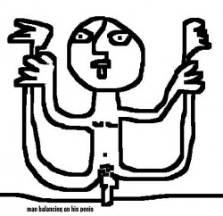 Hello and welcome.
I have thought about putting my paintings online for years but procrastinated because i thought it would be a lot more complicated than it is. I thought I should just fumble my way through it otherwise i would croak before i got around to it. I have been drawing to amuse myself all my life. For an example see 'man balancing on his penis' In the mid eighties i went out with a girl named Ruth who was into drama and art and she took me to some galleries which enabled me to actually consider drawing as something more than just a personal pastime. In 87 i went to the SID NOLAN Retrospective at the National Gallery of Victoria. Seeing so much work by one person for the first time was very impressive to me. But the thing that really got to me was the mock up of his little Melbourne studio of the 40's. There was a bed and a sink and paints and brushes and all the stuff you would expect in a studio. It really struck me that making paintings and being an artist was something attainable. It made such in impression on me that while I was still in the NGV I was thinking about what I needed to do to be a painter myself. |
Archives
July 2020
Categories |
 RSS Feed